As a way to offer a better experience for buyers and sellers at Purplebricks, the Mobile App team decided to redesign the feedback flow on the app. The redesign could improve not just the user journey, but it would also be a kick-start for consistency in copy, coding and visual elements within the app, benefiting the work of Developers, Designers and Copywriters.
Process
The Mobile App team followed an agile and lean approach based on a two-week sprint. Following the roadmap, I worked closely to the UX designer from discovery to wireframes with the aim of understanding the user pain points and the key opportunitites before starting working on the interface.
We began to test the high-res prototypes to not just validate the user journey but also the new app components that I recently created. The tests were remote and unmoderated with both explorative and comparative approach.
During validation, we also exposed the possible solutions to the Product manager and Developers to match with the business needs and scope the MVP based on technical limitations.
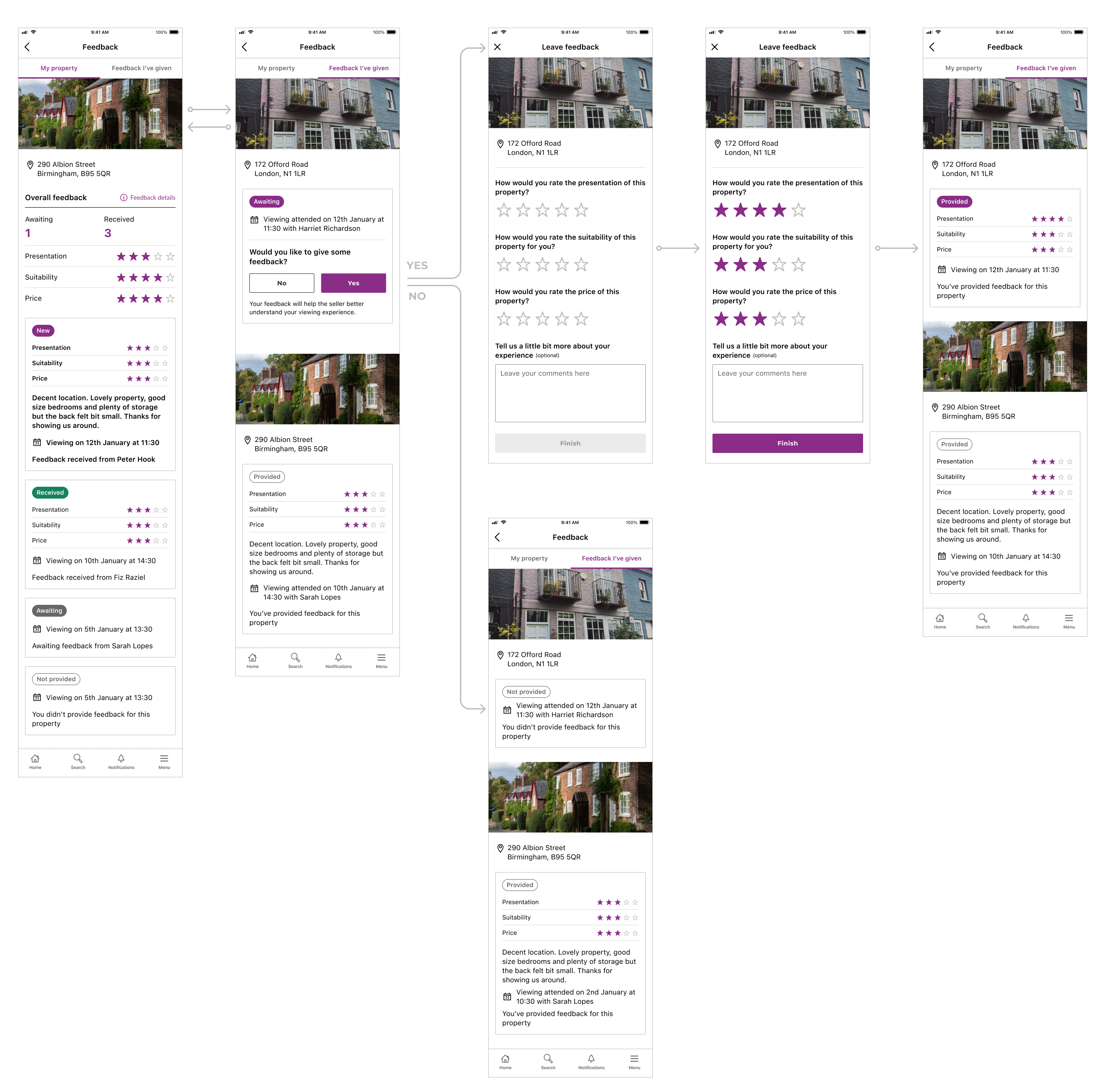
User flow & Design
The user is able to access the Feedback flow throught the main menu in the app. On the Feedback list, it's possible to see the property feedback and feedback given to other properties – one tab can more suitable than other depending if the user is a buyer or seller.
The designs include a status for each feedback and a point of action if there's a feedback awaiting. Depending on the outcome – feedback provided or not – the status is automatically updated to reflect the action taken.