Whilst working on a web portal called "Solutions Hub" – a Shell digital offering for B2B customers and distributors – there was the need to organise, maintain and expand its design system. This was an effort to facilitate the work of both design and development teams, reducing the time it takes to create and deploy new features or modify existing ones by creating a UI pattern library as a part of a solid design system.

Process
I managed my time between working on new features for the product as well as the UI library, being responsible for potential updates to it and making sure the team were using the components correctly and consistently. I worked closely with designers and a team of developers using Figma symbols library as the main tool. Communication was key is our process and there were consistent catch ups with the team to ensure elements met design and development standards.
Foundation
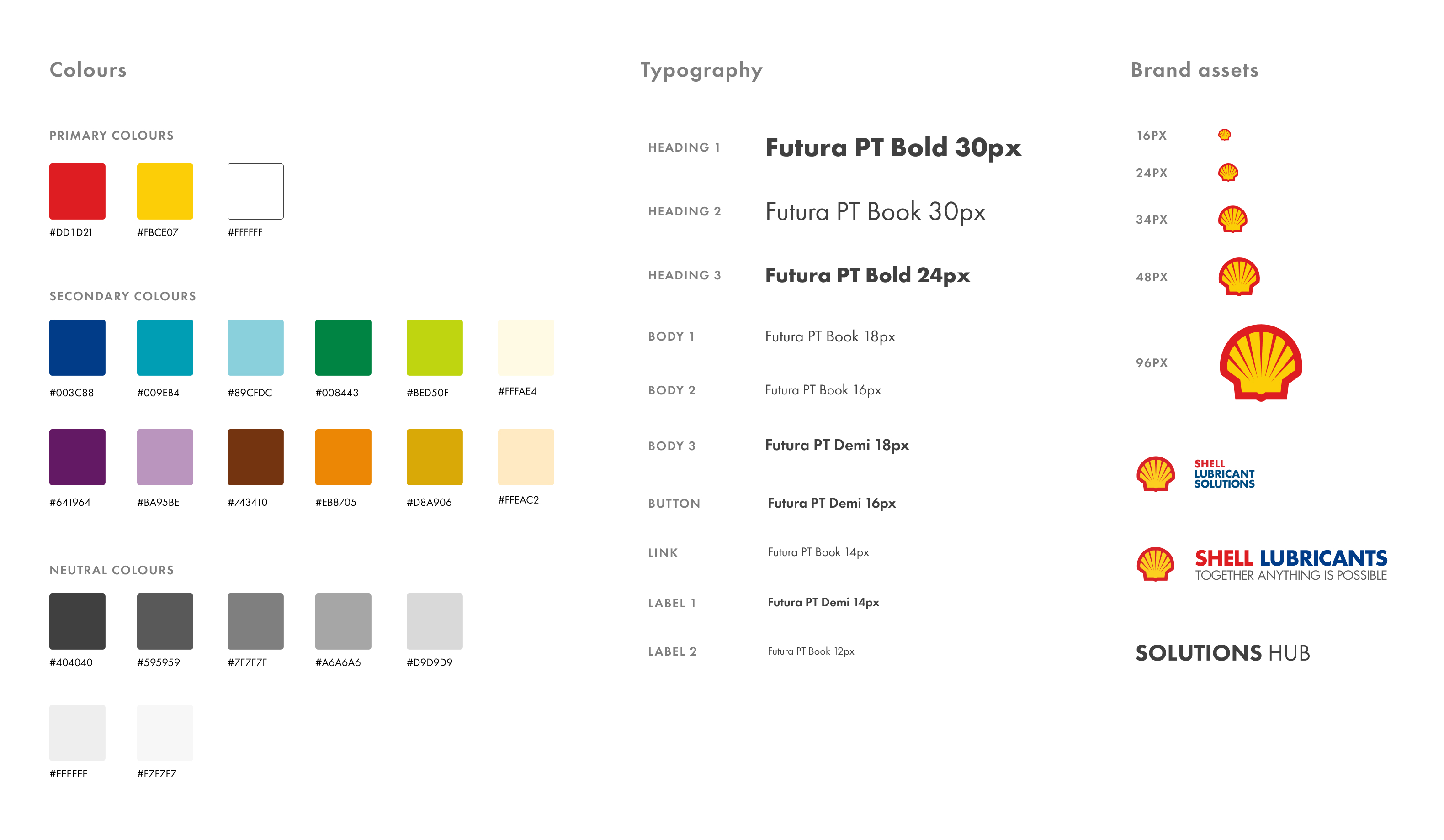
Colours: The primary colours are the key of Shell brand so they remained the same. The secondary colours were amended to work as a support to primary ones and could be used for important actions.
Typography: Futura PT typeface and base size 16px were maintained, but we revised all the various font sizes and line-heights already existed to determine the correct ones to be used. The approach to typography was to use elements such as h1, h2, h3 to determine style and content hierarchy.
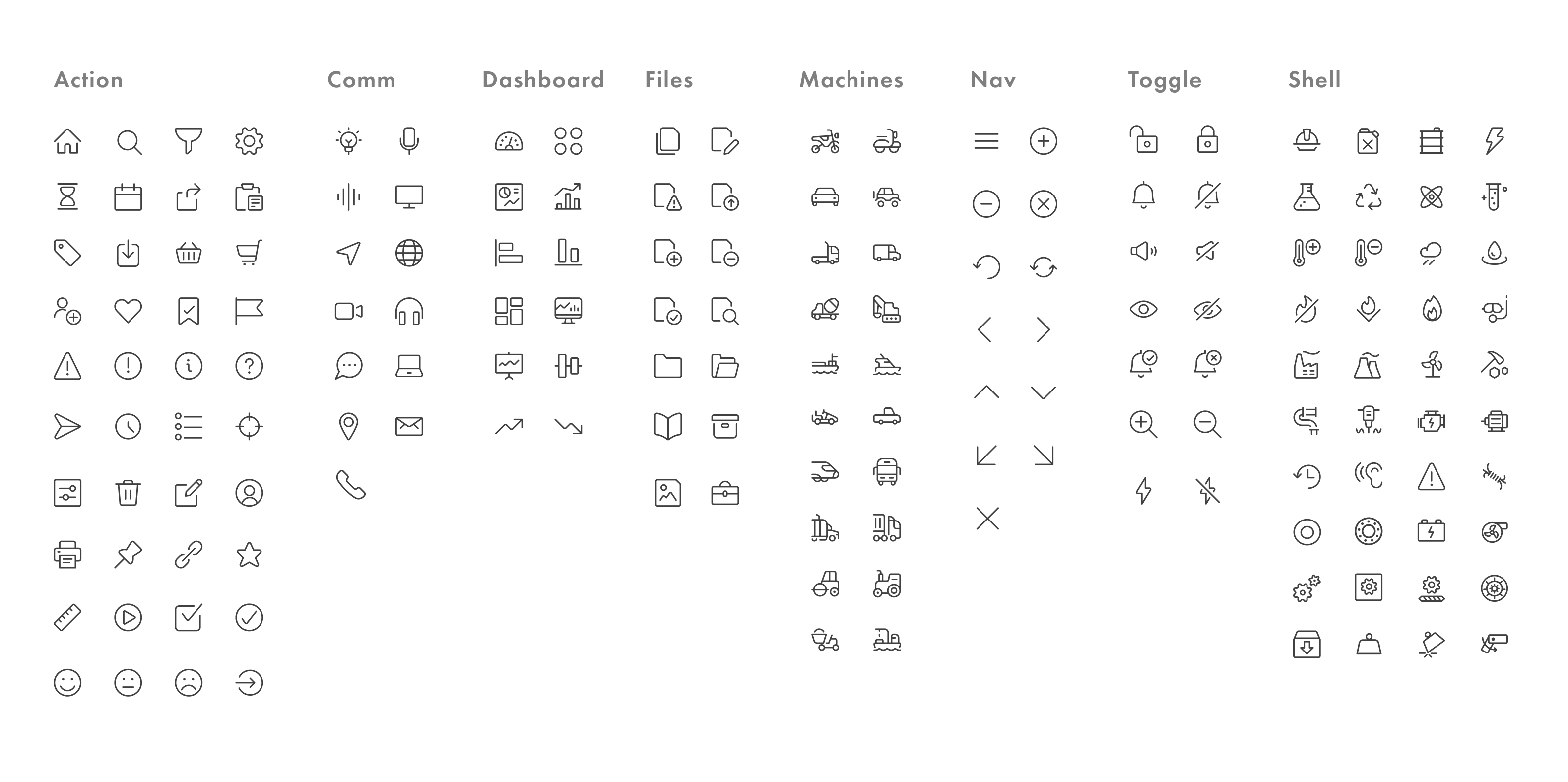
Iconography
I used and created an icon set based on the product needs, some are very specific to Shell so we used simple forms that could be easily understood by the users. The library was organised in sections for easy access.
Grids
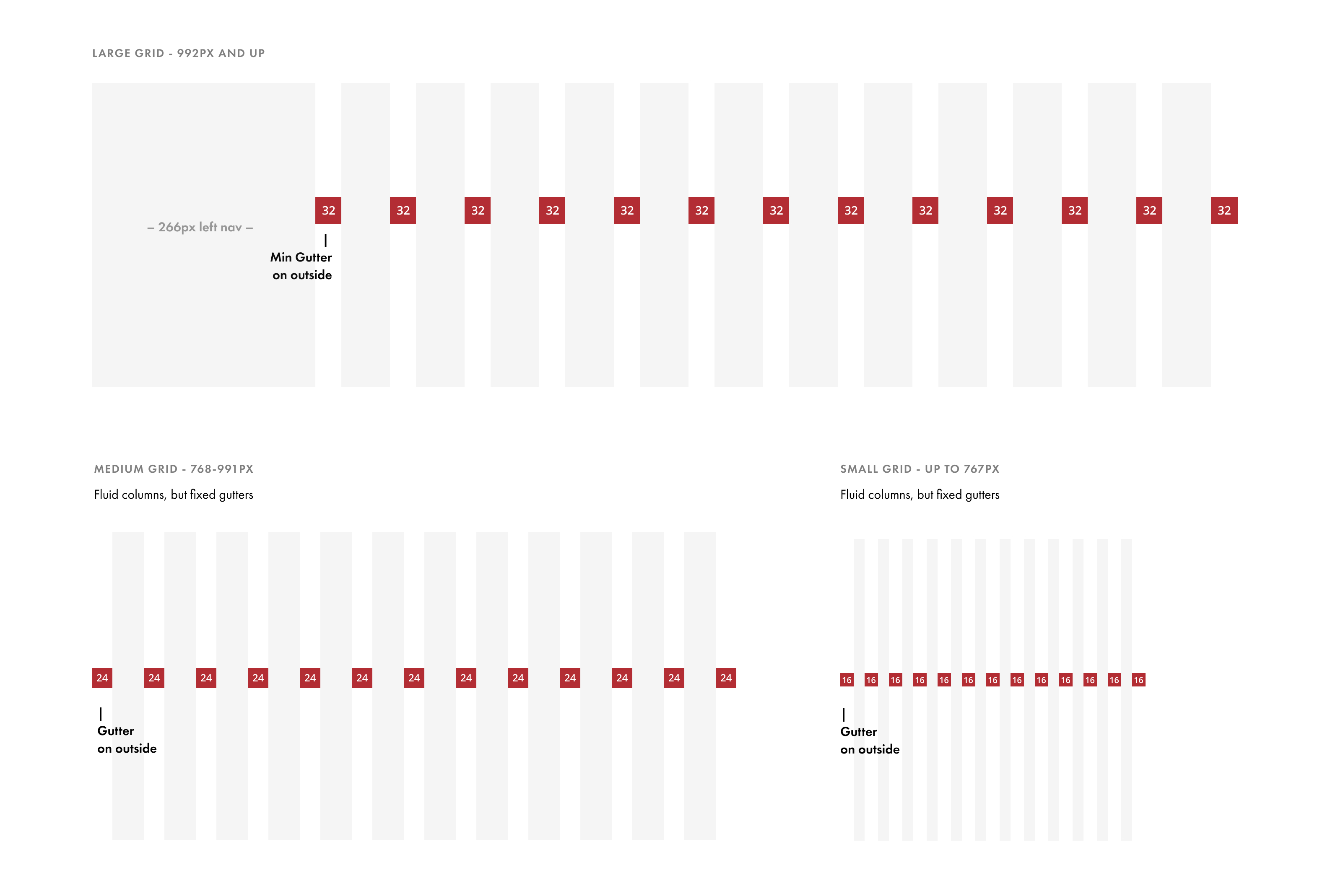
The grid system consisted of 12 columns and max 32px gutters as that provided greater flexibility for the most common scenarios in our platform. There's also a fixed side panel of 266px on the left.
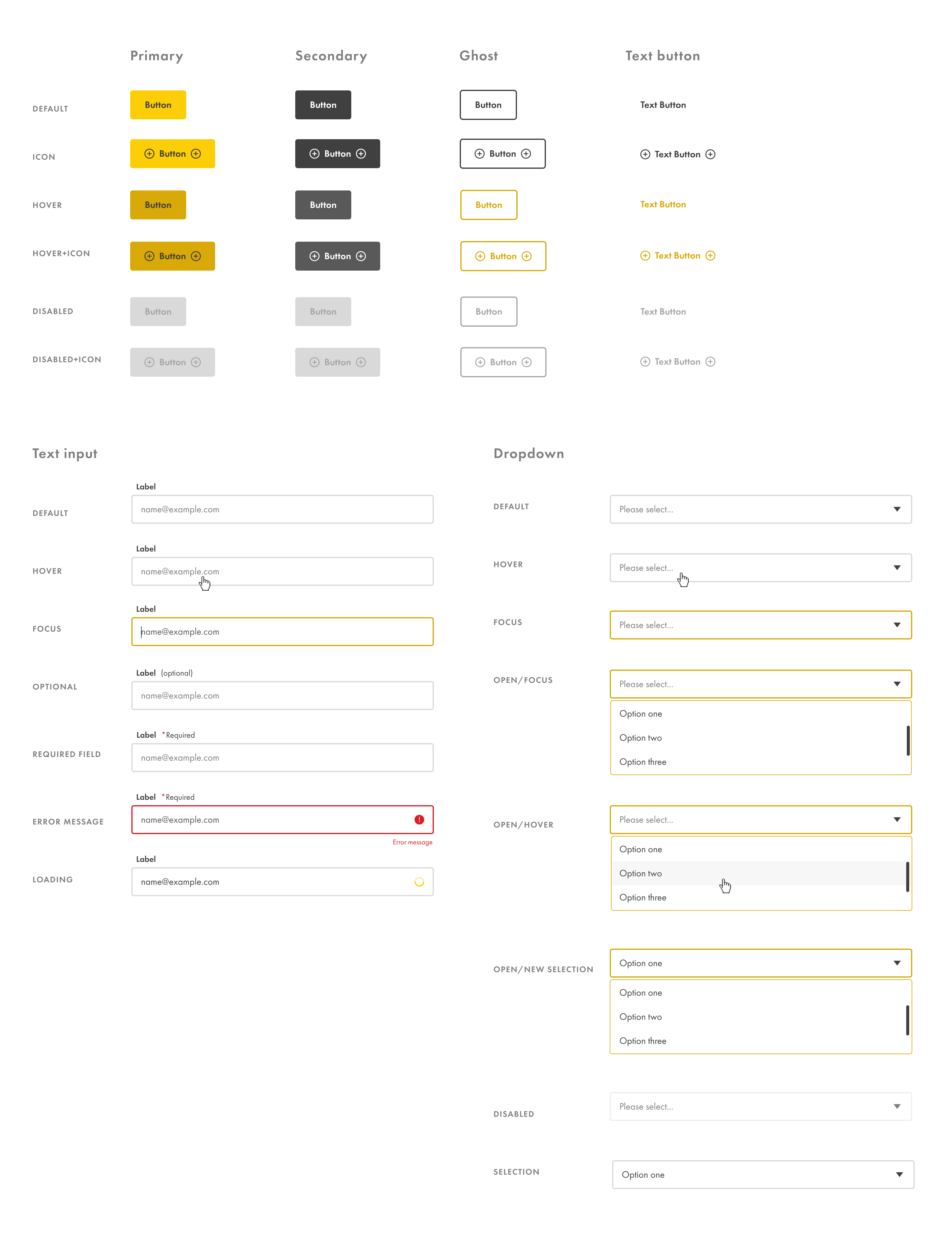
Buttons & Forms
Both elements were redesigned and simplified to meet our product needs.